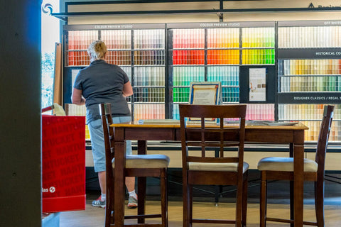
Colour & Lighting with Merlo Paint & Wallpaper
Colour is everywhere and everywhere we turn, we are making colour decisions. There is no such thing as an ugly colour. Colour becomes unattractive to the eye if it is used incorrectly. So where do you start in the decoration of your room? A proper floor plan will help pull all of the pieces of the room together. Work from the floor up. Costly mistakes can be avoided through proper planning.
Remembering that your furniture doesn’t have to line up against the walls, define your focal point – the centre of gravity in a room – and place your furnishings around it. Create a comfortable conversational grouping – perhaps in the winter it could be around a fireplace, in the summer around a window with a view.
Once your use of space is decided a lighting plan is next. To see how colour is going to react in your room, it should be viewed in the daylight under natural light and at night under artificial light. The colour of paint and fabrics can change drastically. This process is called metamerism – which means the characteristic of colour to appear as one colour view in one light and another colour view in a different light.
Daylight at sunrise and sunset is warm in feeling, while daylight at noon can be cool in feeling. Artificial light is either cool, going towards blue or warm, going towards red. Incandescent light is warm and flattering where as fluorescent lighting usually leans towards the cool spectrum. This tends to be clear light and virtually shadowless. Halogen lighting has a strong blue spectrum, which works well to enhance white, greys and blues. A halogen lamp will yellow if it is on a dimmer switch. Candlelight and light from a fireplace is called lighting by combustion – a feeling of warmth and should be used as often as possible.
Questions you should be asking yourself are: How do you want to feel in your room? How does the selected colour effect the rest of the house? What is “in” and do I want to be trendy? Will I get tired of this colour? What if I hate it? And so on…
Nothing evokes emotion faster than the “wrong” colour or a colour you hate. Warm, sunny, happy, cozy and safe. If this is the feeling you’re after, then the warmer colours will produce that feeling. They are yellow, orange, red, violet, brown and cream family.
The warm colours tend to be stimulating in nature making your room visually appear smaller and warm. Rooms facing north or east work well in the warm colours. Rooms facing south or west may feel too “hot” with warm colours.
Wood is a colour as well. If your wood pieces or kitchen cabinets are looking tired, the warmer colours will play them down. They won’t be noticed as much.
If you want to feel sophisticated, elegant, rich and living in a larger space, the cool palette will create that feeling. Blues, greens, black, grey and whites will expand space, enhance the look of wood and give an elegant look.